Smart Board Sketches
From Meda360 Spec
Here are some images saved from a class session where we discussed the basic structure of this website.
captions refer to the image above them
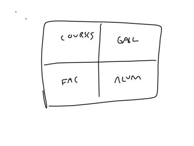
The positioning of the four main content areas in the big picture
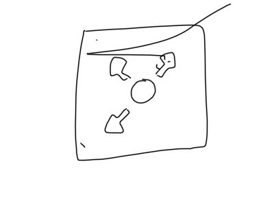
The landing spot. Has an intro and four way navigation. Overlays the main UI and disappears once the user moves away (?)
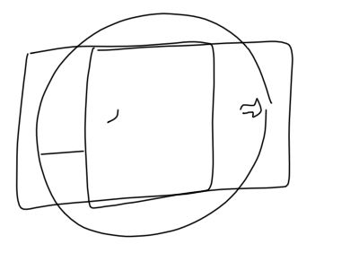
Three zoom levels: content - intermediate - big picture. Clicking in empty space goes to big picture, clicking in content goes to close up, use the zoom utility (utility nav) to hit the intermediate mark. Ghosted arrows appear at the corners of all sections for navigating away.
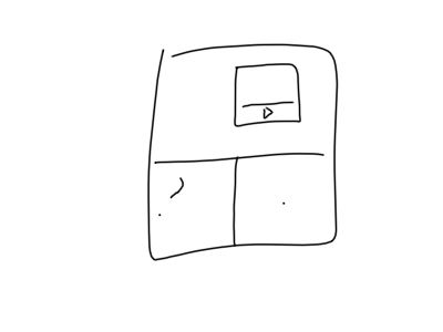
All content UIs use a similar grid system, but elements are placed such that they look hand-drawn and slightly askew. All use a multi-pane approach built from separate movieclips.
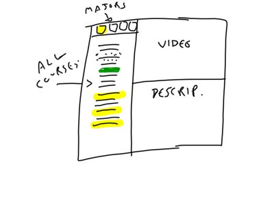
In the course overview, all the courses are listed to the left. At the top-left are the majors (symbolized), when selected each major, highlights in a particular color. When courses have videos, the course listing gets a video badge. Otherwise the course description calls up a text/image combination.
NOTE: we need a UI "widget" for DE-selecting a major and going back to the "ALL majors" view.
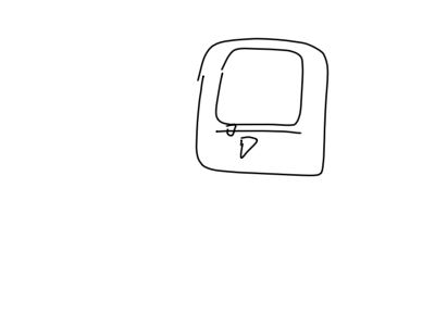
Video players will be simple. Just a play/pause toggle, and a scrubber.
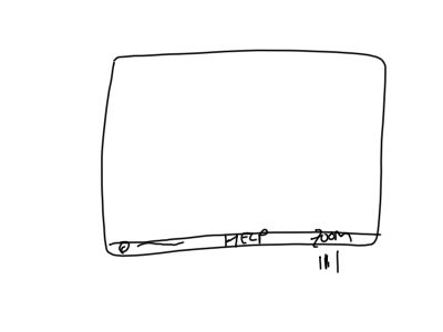
Footer/utility nav includes copyright, "help", and zoom controls. The Help will bring up the intro-text, and links to each section of content. This will be a static bar that sits below all interfaces.
Next Section: bigPicture
Return to: Design concepts
