Navigational/UIdesign
From Meda360 Spec
Navigation and UI Design
Purpose: Instead of running with a stereotypical vertical website full of hierarchical menus in a three column format, the new media department website will use a unique, artistic style that all potential media arts students will appreciate. Its unique experience will engage viewers to stay on the site to see what Pacific has to offer through its Media Arts Department.
Art style:
The background:
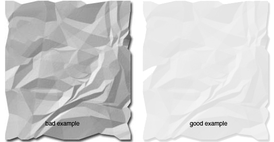
Although the entire background will be white, it will give the look and feel of a large piece of canvas paper. To give it this property there will be crinkles throughout the background, to help give the paper a recognizable texture, as well as smudge marks, and slight shadows to enhance the lighting of the paper. It's important to make sure it's not too obvious. Just a gentle touch of each element can help it feel unique without being ridiculous. The crinkles should not be too great of a contrast

The main interface:
Since this takes place on a virtual piece of canvas paper, every element of the interface will look as if it is "hand-drawn." This includes every part of the interface: windows, scroll bars, buttons, toggles, arrows, tabs, etc. These are to have the look and texture of black felt pen markings that have been drawn by hand.
The use of color
The only use of color is the four main colors used to associate with the four media majors: yellow, orange, green, and pink. Since these four colors are to be applied to the paper as though they were physically created, they are to take the look of being made from a highlighter marker. These four colors were chosen as the four highlighters most used. So these four are to be very brightly neon colored that are transparent over the text which it overlaps.

The middle ground
The area which exists on top of the paper but behind the felt pen may include some random sketches of images. In this case, light pencil style markings will be used. The simple grey won't be distracting, and will instead give the feeling that there was some general sketching of ideas before the project was inked over.
Next Section:Content
